Drawing fabric using line and tone
The Aim
Throw a piece of plan cloth across a chair and make two 15-min sketches, one using line only and the other concentrating on tone.
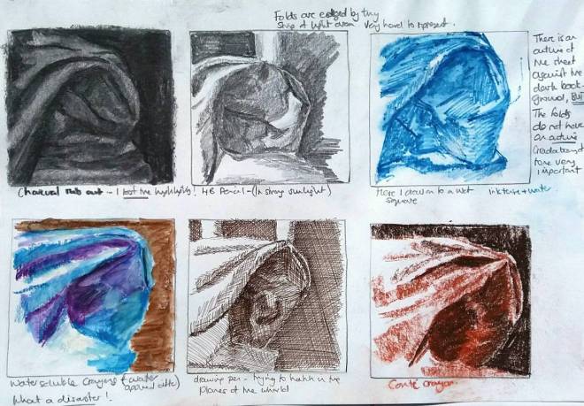
Divide a page into 10 cm squares and draw five-minute sketches of different parts of the fabric using both line and tone, testing different approaches and media
The Exercise
I drew the line drawing from a slightly lower angle than the tone drawing, hence the different view. I found the line drawing hard. I had to concentrate on drawing the shapes made by the fabric. I think that the folds work, but the indents in the fabric which give a 3-D effect without actually being folded was very hard to depict (most evident in my drawing in the top left hand side of the sheet where you can not really discern at first glance what is a peak and what is a trough).These indents were much more successfully depicted in the tone image. By using shading and smudging of charcoal I think the material takes on a more sumptuous quality, which in turn gives the fabric some gravitas. The line drawing remains quite sharp and clinical. Shadows are very important in creating the illusion of depth of folds. This can not easily be done in line alone (although some sense of depth can be gained by a heavier line).

For my smaller experimental drawings using different media, I concentrated on two areas of folded fabric. I tried to combine line and tone here using graphite, conte crayon, felt tip and water and wet watercolour pencils. I found this exercise very hard and quite unsatisfactory. I don’t feel that any of these drawings give a sense of folded fabric. If there is anything successful about them it is that I have managed to use the paper as highlights on the ridges of the folds in the bottom left drawing, using felt tip and brushed with water.

Trying again, I chose a slightly less complicated area of fabric and this time try to show some tonal variation in the background. Putting the material into context certain helps make it a believable drawing I particularly like the charcoal rub out exercise, although i could not get strong highlights to show; the drawing pen where I feel the hatching adds visual interest (especially to the background)and the conte crayon where I have managed to preserve some of the highlights and create deep shadows. The two water based drawings were a bit of a disaster. i found that in both the ink-tense pencils and water, and the water-soluble crayons I ended up with lines for the folds which wouldn’t blend into tonal gradations. As most of the folds don’t have hard outlines these tonal gradations are very important for making the fabric believable.


I think that your approach and the exercises here are really useful, and as the most sincere form of flattery is copying, I will copy your ideas.
LikeLiked by 1 person
I am glad this has been helpful. I look forward to seeing your drawings.
LikeLike