This is my final post on this blog. My OCA journey continues on Practice of Painting 1 if anyone wishes to follow that.
There has been much discussion on student forums over the 2 years I have been with OCA as to what makes a good assessment submission. We all have a list of the criteria that assessors mark by but it seems that students, especially those new to OCA study have little idea of how those criteria ‘look’ in terms of a body of work. It has also been noted on more than one occasion recently that those with good marks come don’t come forward and share that so others can learn from it. Perhaps this is more understandable than trying to decipher the criteria narratives. It can be embarrassing to hold your work up as being deemed ‘good’ or ‘excellent’ when others may not have done so well. It could be considered as showing off, inappropriate and insensitive. Bizarrely it can also seem a little unwelcome to oneself to do so well: to acknowledge it heaps the pressure on to repeat the process and invites you to start looking for the formula that achieved such success, something that the assessors go out of their way to suggest that you don’t do (using 1/3rd of their precious feedback to do so – see below).
Over the last two years I have seen so many different styles of student blogs, some very brief, others full of personal stories and emotional insights way beyond the context of the course. They have all offered something to me and in some cases have been a very humbling read. We are encouraged to share blogs with each other and to learn from them (I recently received a suggested reading list from my tutor which included 3 student blog sites). Fellow students have followed this blog and have been kind enough to offer up words of encouragement, often at times of great (artistic) need. So my final post here finishes my drawing skills 1 story and if it proves helpful and insightful to others then great. This was my first module, a fraction of a (very long!) degree course, fundamental to the learning process but overall insignificant in the grand mark scheme that is a degree. It is in this context that I post my final mark and assessment feedback for this module.
Overall assessment mark: 73%
Assessment Criteria
Demonstration of Technical & Visual Skills (28/40, 70%)
(Materials, techniques, observational skills, design and compositional skills)
Development of excellent visual and technical skills. Highly effective design and composition.
Quality of Outcome (15/20, 75%)
(Content, application of knowledge, presentation of work in a coherent manner with discernment.)
Highly effective work presented in a professional way, showing strong judgement.
Demonstration of Creativity (15/20, 75%)
(Imagination, experimentation, invention, personal voice)
Excellent development of analytical and creativity thinking, showing independent judgements and presenting a developing personal creative voice.
Context (15/20, 75%)
(Reflection, research,(learning logs))
Awareness of an excellent breadth of contexts and debates supporting your growing personal and/or professional knowledge and understanding.
Overall comments and feed forward
Your ambitious submission shows that you understand what the work needs you to do, rather than second-guessing an outcome.
The contextual work is good and you are discerning how different artists can influence and inform your own work.
Continue to be conceptually ambitious (as seen in Light Series 10) but also explore further the potential of fluid media as seen in Reclining Nude 8.
After much deliberation here is my final selection of 12 drawings that I am submitting for assessment. I present them in order they were done on the course with a couple of sentences for each explaining the reasons behind my choices.
Rational behind my selection
Throughout this course I have completed drawings that, amongst many others, I considered to be technically competent. However to discern my final selection of drawings I looked for atmosphere, tension, drama, a sense of life and a sense of experimentation within my work rather than just the skill of representing an object or scene. The biggest criticism, from my (second) tutor has been that I try too hard to make art. I completely agree with this and have discovered that my best works are usually ones I haven’t had fixed ideas about before I started; experimentation is definitely my friend! I did a couple of trawls through my coursework, firstly picking out the more competent drawings. I then used the above criteria to further reduce that section. Once I was down to around 16 drawings eliminating the final few was one of the hardest things I have had to do on this course. Many of my drawings have some of my required qualities but not all and it is often hard to compare two that I consider good for different reasons. However I finally managed to discern my final 12 by considering what this body of work says about me as an artist. I rejected work that may be technically competent but didn’t have, in my opinion, something of the essence of ‘Anna’ in them. This could be a risky approach but I can identify with my final selection as a whole. The drawings all hold something of me: perhaps the beginning of a personal voice.
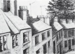
No.1 ‘Market Hall, Chipping Campden’
Conte crayon on cartridge paper.
Market Hall, Chipping Campden
I chose this piece because although it is of a static building the drawing has a sense of life to it. The mark making, textures and choice of palette covey atmosphere and a real sense of place: you can feel the stonework. The viewer is also drawn through the arches to the far side of the street. Having said that this final body of work holds something of what I am about in them, this is in fact the least personal of my drawings. In a way it is a shame to lead with it, but I have opted to display them in course order, so first it must be.
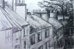
No. 2 ‘Roof Tops I’
Graphite and coloured charcoal with water on lining wallpaper.
Roof Tops I
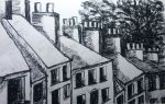
No.3 ‘Roof Tops II’
Graphite and coloured charcoal with water on lining wallpaper.
Roof Tops II
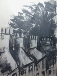
No. 4 ‘Roof Tops III’
Graphite with water on lining wallpaper.
Roof Tops III
Drawing no’s 2, 3 and 4 should be viewed as a series and my comments here extend to all three drawings.
I have chosen these three as I think they are some of the best work I have ever done. They have all the qualities I was looking for. Atmosphere is provided by the palette, the composition and the quick nature of the marks. The water adds tension (the random drips) and texture to the pieces. My biggest problem with this whole series of architectural drawings was selecting which one to leave out. In the end I decided to send Roof Tops IV as a supporting work only. I like the drama and lighting of the buildings of this piece but the tree is less dramatic and there is an awkward space in the top left corner. Although it is darker, Roof Tops III is a more rounded work as a whole and offers the viewer the journey down the hill and around the bend in the road. The exaggerated length of the chimney pots adds to the sense of drama to the scene. I am also sending two studies and my final assignment piece as supporting work. None of them have the atmosphere that my submitted pieces do but they do show the progression (in the case of the studies) that led me to produce the Roof Tops series.
Supporting work for No’s 2, 3, and 4
Study in charcoal
Study in oil pastel
Roof Tops IV
‘Down the Hill’. Charcoal on heavyweight cartridge paper, A1
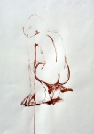
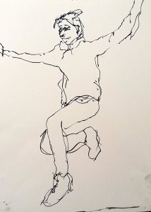
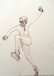
No. 5 ‘Crouching Nude-continuous line’
Marker pen on cartridge paper
Crouching Nude – continuous line with pen on stick
There is beauty in the simple, continuous line of this drawing. The drawing is unfussy, with minimal attention to detail. In fact detail is not needed: the pose has gravitas and the body balanced. The drawing is about the poise of the body rather than the muscular details. The thinness of the supporting arm provides tension as does the depiction of the splayed fingers contacting the ground. I am sending 2 drawings to support this drawing as it came about from a long series of quick studies experimenting with different materials. Both are simple studies made in the same quick way. The ink one and feather quill study is of the same pose, and whilst I really like it (it too is balanced and has gravitas – and I would go as far to say I prefer the angle of the head) the balance between positive and negative space is not as good as the continuous line pose. This isn’t a problem with the ink wash study, and I love the simplicity of the pose with the gradations of tone an ink wash can give. However this drawing lacks the gravitas of the other two. As a viewer you do not get a sense of the weight of the body coming down though the page.
Supporting work for No. 5
22. Ink and feather quill
16. Ink wash with brush
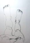
No. 6 ‘Out of the Bath’
Marker pen on cartridge paper
Out of the Bath. Pen on short stick
At first this may seem an odd choice for a ‘best’ drawing. However I have included in my selection because it offers something that many other drawings don’t and that is the engagement of the drawing as part of the viewer’s self. The drawing has to be viewed this way up (the way it was drawn) for the viewer to get the sense that they could be looking at their own feet. This drawing was part of a series I did of my legs as I got out of the bath. I am sending one other (Bath 2) as supporting work. Out of the Bath is a better drawing in the series (and was in fact the final drawing of three stages of getting out of the bath) The slant of the floorboards adds to the sense of perspective and grounds the feet. The right foot is not parallel to these floorboard lines which gives the viewer a slight vertiginous feeling, suggesting the height of the body towering over the feet. It is an intimate drawing with a sense of immediacy about it. Bath 2 doesn’t have the floorboard lines and as such the legs ‘float’ in space a little. There is little detail in these drawings, but detail is not needed to convey the feeling of looking down at ones legs and feet as you exit the bath – which of course is exactly how they were drawn.
Supporting work for No. 6
Bath 2. Pen on long stick
No. 7 ‘Wendy’
Graphite on cartridge paper
Wendy 3. Graphite with left hand
I have chosen this drawing as it is beautiful in its simplicity. The marks convey the central meaning of the pose without fussy detail. The quirkiness of the line (caused by being drawn by my non-dominant hand) adds intimacy to the drawing and the sitters personality seems to leap of the page because of it. The lines of the curtain behind the chair add tension to that intimacy, possibly because their straightness contrasts the curvy lines elsewhere. Without the curtain, the sense of place would be lost too. I was influenced by a drawing I have recently seen by Frank Auerbach when was completing this section of the course and this drawing came out of sketchbook work around Auerbach’s ideas.
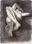
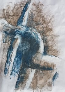
No. 8 ‘Reclining Nude’
Ink on cartridge paper
Reclining Nude. Ink wash lifted out with water
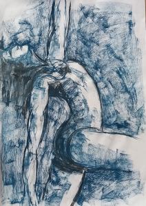
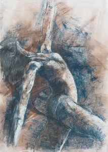
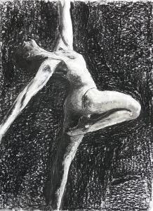
Drawing No. 8 (along with No. 9) came out of a series of experimental studies using line and tone to depict the human form. As well as my sketchbook material I have sent 3 drawings as supporting work for this piece. The first is a large charcoal drawing of a seated model. This drawing relied very much on the addition and removal of charcoal and it gave me the idea to try the same with ink for the No. 8. Whilst I think the charcoal is a successful drawing it lacks the drama of the submitted piece. This drawing has much atmosphere, provided by the blurred outlines of the model. Detail is minimal, compared to the charcoal allowing the heaviness of the pose to come across. The medium lends itself to this feeling of heaviness: the dripping nature of the ink seems to make the body melt into the floor. The foreshortened pose provides much tension and drama to the drawing. This combined sense of atmosphere, tension and drama are missing from many of the other drawings in this series of the same pose including the final assignment drawing for part of the course: the reclining figure in coloured charcoal. This drawing is successful in terms of proportion, pose and technique but it lacks the life of the ink wash study (No. 8) which is much more dynamic. The ink wash and resist study of the same pose is also dynamic but it lacks that feeling of heaviness to the body that I feel makes No. 8 so successful as a drawing.
Supporting work for No. 8
Seated model in charcoal. A1
Reclining figure. Coloured charcoal
Reclining figure. Ink resist Study 4
No. 9 ‘Owen’
Conte crayon on paper
Owen. Conte crayon
I have chosen this drawing because of the sense of command that the portrait brings. There is a real presence to the drawing. The elevated position of the model means the viewer engages with him with a slight sense of awe. The portrait itself isn’t constrained by the boundaries of the coloured rectangle which brings the whole drawing to life. It is as if the model is about to step forward out of the page. My approach to this portrait was experimental and was done as a direct result from research into line and tone (see research book part 4).
Note: Drawings No.10, No.11 and No.12 were all produced as studies and investigations for my personal project into understanding the depiction of human movement in drawing. I am sending my final piece for this as supporting work only as all three investigations produced better work than the final piece.
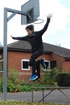
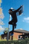
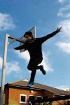
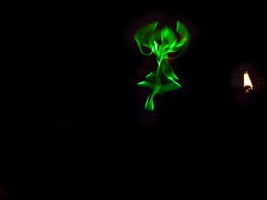
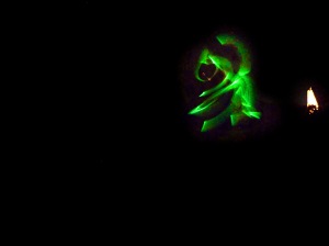
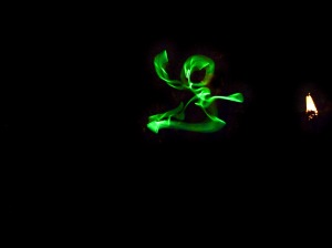
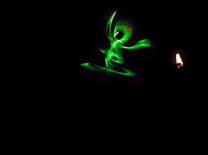
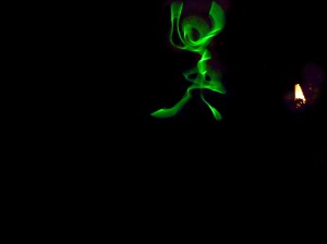
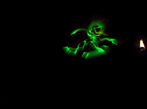
No.10 ‘Light Series’
Drawing with light captured on photographic paper (digitally enhanced)
Light Series
This series of photographs is the result of ‘drawing’ with light and capturing the images with long-exposure photography. I have digitally enhanced each image to increase the contrast between the light drawing and the background. Individually these are very simple, temporary drawings. However captured and presented as a series they give a wonderful sense of human movement. The simple figures are graceful yet they convey the energy of a dance. the word ‘Joy’ springs to mind whenever I see them. The viewer may consider each pose as part of a sequence of movement as the brain fills in the spaces between each pose. They have a vibrancy that the final piece ‘The Jump’ (see below) doesn’t have. The retention of the light on the right hand side gives each figure a real physical presence resulting in a ephemeral temporary drawing captured in a real place.
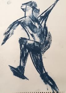
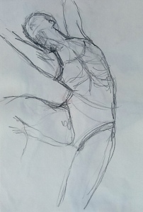
No 11. ‘Untitled’
Natural stone and clear gesso on cartridge paper
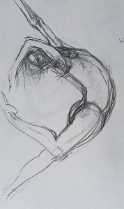
Study in drawing stones on clear gesso
This study conveys human movement with no real detail at all, just a few lines. The human form is only just discernible, but there is enough information, the crock of an elbow of an arm thrown back, the roundness of the hip and thigh, to make the pose and the movement believable. The body is thrown into a curve which provides tension. The use of colour adds to the sense of movement. It blurs the edges of the form. I have been criticised (quite rightly) for adding detail for details sake. This is certainly not the case here and I think it is a very successful drawing as a result.
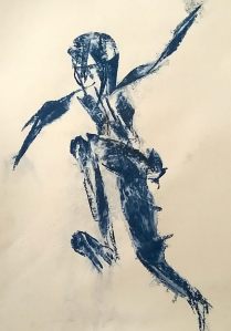
No. 12 ‘Bolero II
Derwent Graphfik line painter with water on graph paper
Bolero II
This is a risky choice for selection as one of my ‘best’ drawings. The piece has been created as a response to watching human movement. However, although it is an experimental piece it holds many of the qualities I am looking for. There is tension and drama in the lines. The two colours ‘dance’ together across the page, interacting with one another providing atmosphere to the piece. Of the several drawings of this type that I did, this one stands out because of that tension between the two dancers (colours). I am sending in ‘Bolero I’ as a piece of supporting work. Compositionally I actually prefer ‘Bolero I’. It sits nicely on the page and has this wonderfully clear middle section around which the drama of the dance flows. However, ‘Bolero I’ was also a response to watching two dancers and there is no indication of this in the drawing. ‘Bolero II’ on the other hand captures that interaction and hence is my chosen submitted drawing. The reaction of the pigment with the water is very important in providing atmosphere. This fluid tension and atmosphere contrasts with the rigid background of the graph-paper grid patterns. This juxtaposition of control against freedom reflects the highly choreographed nature of the seemingly effortless ballet.
Investigating methods of representing movement in drawings
The biomechanics of movement interests me professionally so I was keen to expand my art practice to encompass this. In Part 4 I became obsessed with trying to depict movement in one exercise, repeatedly drawing it in an attempt to capture the essence of movement. Investigating methods of representing movement in drawing is a natural continuation from that point. I decided to concentrate on dancers initially. Dancers move with power and grace, performing explosive jumping movements seemingly effortlessly. Their well-defined muscles make great anatomical studies.
Scientifically there are three things that define what happens when a person jumps: muscles power the jump; kinetic energy is transferred into potential energy; and directional movement occurs. Artistically these translate to a drawing that must convey a sense of muscle strength, exhibit explosive energy and be full of movement. The aim of my project was to investigate how these three things may be represented in a drawing, capturing a fleeting moment of movement.
My investigations into representing movement took me in several different directions. Initially I tried to capture the idea of muscle power and tension using different media and mark making. I was becoming aware that background marks were very useful in conveying movement by drawing your eye along a movement path; but they have to be in the right place to be effective! I experimented with several types of different media and mark making. However I found that whilst I might be able to depict a pose with muscle anatomy and muscle strength evident, the idea of the fleeting moment eluded me. In response to this I considered ways in which such fleeting moments are captured in everyday life: through photograph. This led me to create a series of drawings in which I captured fleeting moments of light moving against a dark sky on a camera. The very essence of movement is evident in these light drawings and I realised that you don’t necessarily need to portray muscle strength and power if you have manage to capture this.
Capturing light with long-exposure photography made me think about artists who were drawing movement in different ways and investigated drawing as a response to seeing movement. The results were very abstract but you could interpret them as having a sense of energy or movement. Some were quite atmospheric.
For my final piece I tried to bring this investigative work together and encompass the idea of capturing more than a fleeting moment through photograph by drawing sequential figures on the same sheet thus providing a sense of movement over time. Colour hadn’t added much to my investigative studies so I chose to work in charcoal whose fugitive nature allows manipulation and soft edges allow the body outline to appear to be moving. I used sweeping marks of clear gesso to suggest forward movement as a visual response by the viewer to the idea of a jump.
This investigation was quite an organic process with my drawing going in ways I hadn’t considered at the start. At times it felt quite disjointed and frustrating with outcomes not what I was expecting. On reflection however I can see that it was the more investigative work that was the most successful in helping me understanding what it means to capture movement in a drawing.
Having experimented with different ways of capturing movement I decided that I wanted to use the technique of adding clear gesso to produce some textual drag lines and then work over these with a time-lapse type set of poses in a soft fugitive medium. I decided to work in charcoal rather than pastel as I find that this allows more reworking and more conducive to a removal technique. The soft edges that charcoal provides also lends itself to soft outlines of the body in movement. My preparation studies for this drawing is outlined in my previous blog post.
I used an A2 piece of heavyweight cartridge paper and applied a couple of random sweeps of clear gesso onto the middle section using a wide wallpaper paste brush. I kept to the middle section of the paper as I didn’t want to over do the background effects. My idea was that the lines that would show up with charcoal would indicate the movement of the jump and so I didn’t want them at the beginning nor at the end. Once the gesso was dry I rubbed charcoal over the whole paper to reveal the patterns. I was quite pleased that I had managed to get a lovely clear up-sweep of gesso in the centre of the page, which would follow the line of the jump. Around it, there were some interesting lines of a more random nature. Using the base of the upward sweep of lines as the starting point of the actual jump I started to plot onto the paper in charcoal the first two poses: the initial run-up point of contact and the start of the jump off phases. In order to get the limb positions into believable movement poses I found that I had to draw on each image separately and then remove and rework lines over the top for the next pose.
My photos were taken looking up at the sky which had the effect shortening the exposure such that all of my models were in shadow. Copying this was not going to make for a successful tonal drawing so I chose to draw light coming from behind the left hand side of the viewer.
First two poses fixing the point of the jump
Once I had a clear representation of the relative height of the first two poses I added in the third of the series, the point of take off for the jump itself. The model still has the toes of the take-off foot on the ground so there is quite a bit of overlap for this image and the previous one. However the leading leg is raised along the line of the gesso in way that suggests drag lines. This was the effect I was hoping for, a sense of quick movement up through the air.
Addition of the third pose, the point of take off.
Finally I added the flight phase of the jump to complete the series. I regretted that I had started a bit too big and that drawing the arms in the positions of my reference photos meant that one ran off the page. Having got this far, I left the drawing for a few days, unseen in the hope that my subconsciousness would work on the problem.
Addition of the final pose
On returning to the drawing I instantly realised that I had created two poses both with the left arm in almost identical positions (and both running off the page) which doesn’t lend to a strong composition. Clearly I needed to alter an arm position but the problem was which one. Moving the arm in the flight pose may have made the final pose more solid but I could not have avoided drawing over the face of the preceding pose. Whilst the flight phase is the end product of the jump I feel that it is the take off pose that actually gives the drawing its momentum and obscuring the face would detract from that. Thus I decided to alter the arm pose of that take off phase. This had the added advantage of the arm sequence continuing in one direction (upward, along with the jump).
The finished drawing
Alteration of third pose arm position and redefining final pose face
Strengths
I think this drawing displays a believable sequence of a jump. I am pleased with my choice of media. The upward sweep of gesso adds a sense of movement in an upward direction. There are odd areas of high charcoal density where is has collected on the gesso. I have mostly been able to use these to darken shadow areas, adding interest by deepening the contrast of the tones. The fugitive nature of the charcoal has enabled me to add marks to the figures and the background to maintain atmosphere. I have used a putty rubber to remove marks to add to this. There is a softness to the figures. The viewer’s eye is drawn to the figures and tends to follow the gesso line upwards. On reaching the point of the jump the eye follows the faint charcoal arc down the left hand side back into the drawing again and across the front of the bench. After that the erased arc on the right hand side draws your eye up again into the jump for the process to be repeated. Comparing this drawing to my ballet dancer series, I find this to be more successful. There is a looseness about this drawing not evident in the ballet dancers. The movement and energy is evident across the whole drawing here, where as the ballet dancer was more static and any energy or movement very much a consequence of the background only. This drawing works as a whole.
In my previous blog post ‘Anatomy of movement’ I stated that to depict movement in a drawing the characteristics explosive, energetic, muscle power and directional must be shown.
Explosive: The sequence depicts a jump which inherently is an explosive movement however in this particular drawing it is the incorporation of the third pose (just before take of) that really shows the explosive nature of the jump.
Energetic: In this drawing I think it is the time-lapse sequence itself that conveys the most energy. The poses were chosen for their limb and torso angles, they show a body undertaking an energetic movement. This has been coupled with textural, directional lines that add energy to the image as well as atmosphere.
Muscle power: These figures are fully clothed and so active muscle groups are not on display to show the power being used for this movement. Rather I feel that it is pose 1 that conveys a sense of the effort needed for the jump. Specifically it is the angle of the torso, the figure is really leaning into the task of leaping up onto the block. The limbs are rotating believable around their joint centres in a way that counter balances the movements of the torso.
Direction: The jump has a linear direction to it, jumping across and out at the viewer. The limbs also have rotational direction associated with them. The arms and legs rotate around the shoulder and hips bringing a sense of balance to the series of poses.
Areas to be improved
Most obviously it would have been better to use an A1 piece of paper and thus not cut the hand of the final figure off! I could also have drawn each pose smaller to the same effect but I think I would have struggled with some of the detail in the faces and hands if I had done this. maybe I should have left off the facial detail entirely. I did struggle with them and they do look a little flat compared to the rest of the picture. Are they entirely necessary? Possibly not, after all the drawing is about the movement not the detail of the people.
I don’t think that I have got the orientation of the final pose quite right, the torso and head are turned away from the viewer slightly too. It would have been better for this figure to be leaping out towards the viewer a little more. As such at times, pose 3 seems to be in front of the last pose. There are two reasons for this error, firstly my photos were taken with the jumper leaping off the bench in this direction and secondly my interpretation and compensation for this directional difference was not as good as it could have been.
Whilst there are areas of contrast throughout this drawing it was extremely difficult to keep the paper completely fresh and it is always more difficult to get a lovely bright white once you start erasing the charcoal. The highlights could be slightly stronger if I hadn’t had to rework so many areas in the execution of the drawing.
The time-lapse sequence works and I feel there is just the right amount of overlap between the poses. However it may have been better to have found a technique by which the first three poses were lighter than the last one. This would have the effect of drawing the eye to the final leap but also give the impression of time passing by the memory of the preceding images fading. This would have been extremely difficult to achieve in charcoal at this scale, I would struggle to find enough tones to produce convincing poses. A more mixed media approach may have helped this.
General Discussion
Sadly, I am disappointed with myself for the work I have produced for the whole of this assignment. With possibly the exception of the drawing on this page I don’t feel that any of the work I have produced for this assignment is of the same quality as my previous assignment/coursework. I have tried new ideas in this part (for instance light drawing and kinetic drawing) but my experimental work and studies for the larger pieces seem to fall flat. Even though I had a fairly clear idea of what I wanted to do, I think without the direction of the specific exercises I floundered a little. I struggled massively for time too which didn’t help as there were long periods when I was not able to draw. Consequently I found myself under pressure of time passing which just made things worse and I grew frustrated when things were not working out as I would have hoped. In previous parts of the course some of my best work has been experimental and quick! My studies for this project mostly just look rushed, a subtle but important difference. It was hard to put together my best pieces for my tutor. What do you do when you don’t have any ‘best’?
It wasn’t all bad however, I did find myself enthralled with the way pastel created whorls on paper and acted as an optical illusion in a slightly hypnotic way. It is why I ended up doing so many in that style. A little formulaic perhaps, but the bright colours and satisfying marks did lift me out of the doldrums for a bit! I found I wanted to do a yellow one, then a blue one then a purple one and so on, the colour very much became the driving force for producing more drawings but it doesn’t really lend itself to the project as a whole. I was using it for the wrong reasons and I had to make myself stop so that I could progress with my project! I also found the light drawings exhilarating and quite addictive. I could have spent all night drawing in the night sky. Partly they were successful because I could do lots, then pick the ones that worked!
Do I feel I progressed over this part of the course? Overall I think I did, even if it is from learning from my errors and disappointments mentioned above. I certainly have ended with a greater artistic understanding of what movement in a drawing may mean and how it may be conveyed thorough different techniques. Whilst I may be expressing disappointment with much of my work I do feel I managed to demonstrate those techniques in my charcoal drawing of the jump.
Reviewing my research and sketchbook / study exercises I have come to the following conclusions regarding depiction of movement in drawing:
Fast movements by definition are:
explosive
energetic
display muscle power
directional
These four characteristics need to come across in a drawing for the movement to be believable. . There are five (interlinked) areas of a drawing in which these characteristics can be displayed:
The pose: the arrangement of limbs and torso display the movement. A viewer will most likely be able to empathise with the position of the figure and thus understand the image in terms of movement. Removing the figure from the floor also allows the viewer to understand movement even if it is just the potential act of gravity. Correct muscle anatomy should allow the power of the movement to come through although clothing may not allow this to be immediately obvious.
Mark making: quick lines suggest energy. Gestural lines have an immediacy about them that invite the viewer to understand that movement is being depicted. Explosive marks may also radiate energy of the movement. the muscle force used to make an explosive movement will drive the body in a certain direction (F = ma). Mark making can show that direction. The marks may make up a figure, but they may also be abstract and not attached to the form. In this case act as visual aids leading the eye in a direction of the movement.
Background: dynamic background marks put a figure into the context of a movement. When viewing an explosive movement a viewer can do one of two things. They can either focus on and follow the figure in which the background appears to moves or vice versa.
Composition: a sequential series of drawings presents the viewer with a time-lapse effect of the movement. It will show directional propulsion of figure(s) but will also show directional rotation of limb segments. This contrasts with the idea of capturing a single fleeting movement as the viewer will now see a series of movements that can be imagined as a fluid movement.
The act of locomotion: the drawing comprises movements made by the artist, so-called kinetic drawing. The image is the resulting mark making. Perhaps this is in fact installation art as can the drawing be complete without the artist making the art?
The process
Based on the above points and my research into different artists work I decided I wanted to show a jump (explosive, energetic and directional movement) in a sequence of images similar to those old photograph sequences of Muybridge. Having committed myself to this idea I had to choose my reference photos. The ones I chose (in order of jump sequence) were as follows (they have been renumbered to reflect the sequence of the pose in the jump):
Pose 1
Pose 2
pose 3
Pose 4
Problems that I had to overcome:
My sequence comprises 2 different models so I would have to adapt my drawing so that it all looked to be the same person. I chose to centre my drawing on my son as my daughter’s hair and glasses complicated the image.
My camera had overexposed the models in the photographs as I was shooting upwards to a bright sky. This means there was little in the way of contrast of tones within each pose. I would have to come up with a believable lighting plan for my drawing
My view-point was a little different for each of these poses so I would have to make sure this was accounted for when drawing the images to make a believable sequence.
I did a quick sketch of the 4 poses together on A4 graph paper to get a sense of how they would fit together….
Study of all 4 poses together in sequence
and having messed up the axis of the body of pose 1 I did a separate sketch of this pose.
Pencil study of pose 1
As my figures were fully clothed the muscle power was not going to be evident from bulging muscle groups. Rather correct limb proportions and believable torso axis were going to have to convey the power needed to lift the body up into the air. The medium I chose was going to be very important for the mark making to portray the body and its directional movements. From my studies I could see that hard pen or ink lines were not going to work. A softer medium which could be blended would allow areas to be softened if necessary to provide contrast and atmosphere. An erasable medium would also allow gestural abstract marks to be added through a removal process which could add dynamism to the drawing. having done my ballet dancer series in pastel I was keen to use something else. Charcoal seemed the obvious choice but sometimes charcoal can be too soft. I decided that I could add background texture by painting streaks of clear gesso onto the paper surface before adding charcoal marks. not only do the brush strokes provide directional lines but the charcoal can cling to splodgy areas of gesso in a greater density than on plain paper allowing areas to be blocked in much darker than they would otherwise. the downside of this technique is that you can’t actually see the gesso when you apply it so the process has a certain unpredictability to it. If you can get past the fact that the areas of blackness and the directional lines may not work to your liking this unpredictability can be a bonus: you have to work with what you end up with!
I was also keen that the face of the final figure was not bogged down in detail and not necessarily a likeness to my son. I needed to produce a recognisable face but include very little detail. I had a look at faces in drawings by Gary Hume, Colin Crotty and Mark Hurst (all in my research book) to see how faces can be put together indistinctly. I came up with the following as being important:
Finding a face
Light reflected off areas of head, forehead, eyelids, ridge of nose, cheekbones and point of chin
Dark shadows in rest orbit, nostrils, under the nose and around mouth region
Armed with this preparatory work, I set about creating my final jump drawing, presented in my next blog post.
Having produced a series of single images in a variety of ways I decided that I wanted to try another idea, that of creating a series of poses to show a movement. I have long been a great fan of Eadweard Muybridge (1830-1904) and his pioneering locomotion photography work in the 19th Century. Inspired by some of his sequences I wanted to produce a time-lapse series of drawings based on a jump. I started by studying some sequences published in Muybridge, E. (2000). The Human Figure in Motion. Dover Anatomy for Artists.
These are very quick sketches done on graph paper (Muybridge photographed his subjects in front of a lined background so changes in height can be recorded).
Muybridge, Women stepping from rock to rockSequential poses drawn in different coloured biros on graph paper
I chose 4 sequential frames from a point of foot contact with the substrate (in this case a rock) and drew each pose quickly in a different coloured biro. I was not overly concerned with detail, what I wanted to capture was a sense of the sequence with the body being connected to the space at one point. In reality this was a harder exercise than I anticipated not least because each individual photographic plate is quite small. They are also quite grainy (this was pioneering work after all). The graph paper was useful as it allowed me to observe and record changes in the relative heights of the body segments. However the resulting sketch is very crowded and I can see that this may not be the best point to start. The view-point is also very linear which does not make for such a dramatic sequence. So I change tack and try capturing some flight periods of jumping from a different view-point: behind the jumper.
Muybridge: Man, a straight high jumpSequence of man jumping, rear view
The problem with viewing a jumper from behind is that you can not run your sequences together to a coherent sequence, you are always jumping from frame to frame with your eye (no pun intended). So I revert back to the lateral view and do some very quick 1 and 2 minute studies of sequences:
Quick sketches of sequences
My main aim in the studies below is to look at the angles of the body axis to show forward movement, followed by some more quick sketches of the high jumper. I have added smudging lines by running across the ink in the bottom set of drawings here. Interestingly the eye automatically takes in the body first then leaves the image by way of the lines, so those lines smudging in a forward direction actually cause the image to appear to be moving backwards.
Working with Muybidge sequences, as pioneering as they were, has its drawbacks. Firstly they are very small and secondly they are limited to two view only, either lateral for dorso-ventral views. Whilst they are excellent reference material it is because of these two points that I realised I was going to have to find my own sequence of movement to photograph.
Whilst sorting out photography I did a quick series of sketches using some of my ballet dancer poses in the style of Judith Kunzle. The idea was to repeat a motif or figure, each in a slightly different position so that the viewer gets a sense of movement from the series.
Repeated motif of dancers. Ink and compressed charcoal
My dancers here look as if they are tripping over the floor! Space and shadows are needed to get that height and energy over to the view!
Creating my own sequence
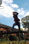
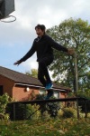
I took my children to a local park and photographed them running up and over a bench. I chose single frame photograph rather than video for this as I wanted some spontaneous poses to draw from without a dictated path. I felt a video would draw me in to accepting all that was in front of me frame by frame without room for interpretation. Taking individual pictures ruled this out. I did manage to get 2 or 3 shots of the same sequence but the greater changes in the body positions between two sequential photos allowed for a bit of interpretation of my own: I wanted to be able to build the path of motion up myself. I positioned myself down at grass level pointing the camera up so that they were jumping past me to my left avoiding a lateral view. I tried photographing from a variety of angles and heights. From the resulting photographs I selected 6 poses that had limbs in interesting places and that conveyed a sense of the jumper coming towards me with height.
Pose 1
pose 3
Pose 2
Pose 4
Pose 5
Pose 6
Pose 1 and 2 were from the same sequence, poses 3 – 6 were of a different child and from 4 different sequences.
Quick Studies
From these photographs I did a series of very quick (1 or 2 mins only) A3 drawings using different media to see what effects of movement would appear.
1. Marker pen on a stick with non-dominant hand
2. Marker pen on stick with dominant hand
3. Coloured charcoal chunk on wet paper broad-side strokes only
4. Coloured charcoal chunk using broad-side only
5. Coloured charcoal sprayed with water
6. Glass dip pen and ink
7. Dip pen and ink
I particularly like the coloured charcoal studies (no’s 3, 4 and 5). The pose is very dynamic with the foot off the ground coming towards the viewer in a dramatic way. The slightly abstract nature of these three drawings appeals to me. The same pose in ink (no.6) is fussy and boring in comparison, lacking that sense of power in the movement. These were all A3 studies (my equivalent of thumbnails!) so I decided to go big and do an A1 quick study using graphite and water to capture the sense of movement found in the smaller coloured charcoal studies.
A1 Mixed media study
I used graphite putty to draw with big bold strokes onto wet heavyweight cartridge paper to produce the study below. It was a bit of a mistake as I didn’t get the shading right and once you wet graphite it is actually quite hard to erase without damaging the paper surface. In addition the graphite forms a very smooth shiny layer over which it is incredibly difficult to layer other drawing media. To rectify my mistakes I went over various lines and using charcoal and oil pastel and tried to reintroduce highlights with white. None of this really worked but I kept going until I really had had enough. I didn’t manage to rectify it and over all this was a bit of a mess, but the resulting image does have one redeeming feature and that was the depiction of the leg raised in the air. It really has sense of coming out of the page. It is an area that wasn’t overworked at all and managed to retain that fresh feel to it. The photograph is not very good. I could not get a better quality image from it, the light is bouncing off the shiny graphite and bleaching out the top half. However the area of interest, the raised leg is clear.
Oil pastel over ink
I tried to do a reveal study of this jump using white oil pastel on paper and a wash of brown ink. It didn’t really work so I went over the drawing in oil pastel, layering different colours on top to find effects. I found that scratching back into the oil pastel with my finger nail produced some interesting edges however the study holds little else of interest. There is a slight air of movement about the pose created by the direction of the dark oil pastel lines on the left but it is a scrappy drawing. I don’t understand how to use oil pastel, it always looks so flat even when I have added tones to structures. My final drawing was not going to be in oil pastel!
Ink and water
I tried to use ink on wet paper to create some of the effects I managed for static poses. Again the results were very unsatisfactory although perhaps marginally less so that the preceding study! The water splodges do add a bit of movement to the pose, but it is not dynamic enough. The edges to the figure have dried before I could blend them creating quite a hard outline in places. The pose was too complicated for me to work any quicker so I feel that ink is not the way forward.
On a more positive note the more I worked with these photographs the more I became convinced that I could put them together as a coherent sequence to create my own time-lapse sequence. For all the problems I was encountering I particularly liked this leaping pose and was keen to include this.
The preparatory work for my final drawing is presented in my next blog post
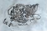
In my original research into artist’s depicting movement I discovered a category of drawings in which the drawing was the movement rather than the image (such as Heather Hansen Emptied Gestures ). These kinetic drawings can be viewed either as the process of the drawing including the motions of the artist or as the finished product where the artist is absent by the meaning of movement is portrayed through the repetitive lines. I decided to have a go at a kinetic drawing myself, however I was not able to set up a huge area of paper draw in the way Heather Hansen does and thus was not going to be able to capture movement of my own body in this way. Having been very drawn to the work of Julie Brixey-Williams who uses amongst other techniques, performance to inspire her drawings I decided that this such approach would be more achievable in my small space.
Given my lack of access to live performances I decided to use you-tube videos of contemporary ballet dancers as inspiration for my kinetic drawings. Whilst watching the dance I would set up a pen on paper and let my hand respond to the performance in front of me without looking at the paper and see what happened. I imagined that my resulting pen line would in some way resemble the movements I had seen and hopefully display some of the dancers energy.
The results
Initially I tried the technique out watching a dance video called Painted (dancer unnamed). I chose to use A3 graph paper because I like the juxta-position of the perceived freedom of movement against the controlled, choreographed nature of the dance. I felt the squares of the graph paper represent the control and choreography of the sequence in a defined space whilst at the same time, my drawn line was free to ‘wander’ across this space in response to the visual stimuli. Here is the resulting drawing using a Graphik line painter on graph paper.
‘Painted’
Not the most inspiring of pieces, and taken out of any context you would be hard pressed to find any movement or meaning within it. However part of the problem is the nature of the line itself. Whilst it appears to leap and twirl about the paper there is very little variation in the line itself, except for a few areas where I have made fast, sudden marks and the line thins a little as it only skims the surface. In order to try to add some interest to this technique I repeated the exercise several times, using wet graph paper and the graphik line painters. Click on the drawing title to take you to the video clip that I used. I was selective in my timings for these drawings, drawing only for 1-2 mins (so not to completely obliterate the results). I did not necessarily start drawing at the beginning of each clip. The line painter responded to the wet page and produced as I had hoped a greater of variety of line through the flow of the pigment. This is not something I was controlling rather a random element that depended on how wet the area of paper was and how long the pen remained there (ie dependent on the speed of my pen stroke).
This drawing of ‘The dance of God’ was quite controlled. I wasn’t looking at the page but I have managed to stay in quite a small area. I think I was drawing from the wrist only rather than my arm, resulting in smaller, less free movements with the result of a ‘tight’ drawing. This doesn’t allow the freedom of dance movements to come across. I made a conscious effort to use my whole arm for the next attempts.
The Spider Dance video is worth watching for the amazing feat of a dancer moving in the most incredibly realistic spider-like locomotion I would have thought possible! My drawing has captured some of this movement and I am quite pleased that when I look at it I am instantly rewarded with a memory of the dance and the amazing feat of athleticism. I am not sure however that a viewer that has not seen this dance would feel the same. I do feel that this drawing however does have some structure to it (in an arachbid sort of way?), possibly because it has a certain amount of symmetry in the lines.
The paper was particularly wet for the Bolero dance and the black pigment ran much easier that in the other drawings. the result is much more movement throughout the page, but still not necessarily a drawing that displays much out of the context in which it was done. I really like the fact that there is a part of the middle of the drawing where I accidentally missed wetting the paper giving a lighter, more lucid area of line amongst a billowing cloud of lines. This dance was performed by two dancers and I have responded to their interactions throughout the sequence that I watched. I really like the result of Bolero, it has atmosphere, is centered on the page and conveys the energy I experienced with viewing the ballet.
For Bolero I was responding to the movements of two dancers with just one pen line. I was curious to see what would happen if I used two pens, one in each hand for each dancer, and drew simultaneously.
Here the male lead is drawn in blue and the female in green. It was incredibly hard to get my left and right hands to work independently but I did manage a little. Whilst there is cross-over on to each side of the paper for each dancer, they predominately stayed in their ‘respective halves’. Whilst it is interesting to separate out the dancers with different colours, I think that this drawing has lost the sense of movement that the single line Bolero drawing had and whilst it does show interaction between the dancers it doesn’t depict energy or movement. The green and blue pigments haven’t responded to the water in quite the same way that the black pigment did. Bearing this in mind I had one last try going back to the Bolero dance (because I love it as a piece of music) but with a red pen for the female dancer and a black pen for the male dancer.
Massimo Murru and Lucia Lacarra dancing ‘Bolero’ II
This last effort, Bolero II, turned out to be one of my favourite drawings because for me what comes across is the intensity of the relationship between the two dancers, portraying two doomed lovers. There is tense, movement in the drawing, not as much perhaps as the original Bolero above, but definitely holds energy and vitality. The response of the pigments to the water adds atmosphere to the drawing (compare to the green and blue of the ‘Mozart’ drawing above). Bolero II isn’t centred on the page is such a pleasing way as the first Bolero and it lacks that enticing middle section, however I think that the tension provided by the second pigment colour more than makes up for this. It is a drawing that you can look at time and time again and feel different emotions as a viewer. The leaps evident by the male lead (black pigment) add a lot of energy to the drawing ( for instance compare to Mozart above). There is a certain ‘Jackson Pollock’ quality to the final image!
Summary
These are kinetic drawings where the line has been produced by my arm/hand/pen following and responding to the visual stimuli of strong energetic movements of dancers. Taken out of context I am not sure any viewer would appreciate these drawings in any way, they could be construed as a mess with no coherence to them. However some do convey an immense sense of energy and movement, for instance the two Bolero drawings. Whilst I don’t suppose for a moment that these drawings will be seen as improvements on my drawing skills, this has been an interesting exercise for me. It has allowed me to express emotions through random pen lines without being constrained to a resulting image. These drawings are a pure response to human movement and mark a huge leap forward in experimentation for me. In a way these drawings have been as liberating as the exercises at the very beginning of this module, the exercises where we had to make marks recording our emotions. This freedom of expression has often been lost in my work, where I have often been criticised quite correctly of trying to hard to make art. I can see the value of such exercises to try to retain this freedom of expression. I certainly feel free and energised in producing this type of work. Perhaps this is a lesson learnt a little too late for me in this module but it is a lovely lesson to be able to take forward.
My work so far has lacked the idea of capture of a fleeting moment (or at least it is the quick studies only that seem to have this essence about them). In everyday life we are constantly capturing fleeting moments with cameras. This has made me think that perhaps there is some way to capture fleeting movements by using drawing and photograph together. I have enjoyed experimenting with various ‘reveal’ media throughout this course, where you draw with wax or white oil pastel on white paper, then wash ink over to reveal your image underneath. These two ideas can be combined by revealing a drawing on a photographic paper, through the capture of light. Inspired by Julia Brixey-Willimas No(t)here series of drawing of dancers on photographic images I took some glow-sticks out into the garden after dark and perched my digital camera (Panasonic Lumix TZ8) on a table with the shutter on maximum exposure time (8 seconds). My garden is higher than the patio so by setting the camera on self-timer I was able to run up to the grass and start drawing in the air with the glow stick for the duration of the exposure. This is a different type of reveal drawing as you don’t get to see the image until you playback your camera images. I concentrated on drawing people jumping, trying to capture some movement. All in all I did about 20 of these light drawings and the results were very variable, however I was pleasantly surprised by some of them! Here are a few of the better ones.
The darker photographs of numbers 1 and 2 are how my set up was supposed to be, but my children kept turning on the lights in the house behind me, illuminating the edge of the garden. I think in fact this low-level illumination adds something to the images, it makes the ghostly green figures appear to be leaping up from the ground rather than just floating over it. The light from the neighbouring house appears a bit of a distraction but when I crop it out, I think the image loses something. It is as if the light ‘grounds’ the image and gives it context. Unfortunately when I tried to print these images, the contrast between the green and the background were not very strong. In order to use these images I therefore had to do some post exposure production. Using photoshop I enhanced the green of the light. In order to make this stand out enough for a printed version I also had to darken the background to a fairly uniform black colour. Whilst this resulted in the loss of the immediate foreground I did however leave the bright light on the right hand side to keep the figure in some sort of context. Once the figures were enhanced, I loved the energy that each pose had!
I decided that these would look good as a series for my final assessment, presented together in a block. I spent some considerable time trying different orders of the images. In the end I have chosen 6 light drawings (Light 1 – 6 above) presented in 2 rows of 3 (Light 7 and 8 were not included as they are more reminiscent of flying insects than people). They are not sequential poses (after all they were all individually drawn with no reference to one another) however presented in a series allows the viewer to engage with the idea of continual motion. The position of the bright light remains constant and the figure dances around the black space.
My final presentation of these images as a series for assessment is as follows:
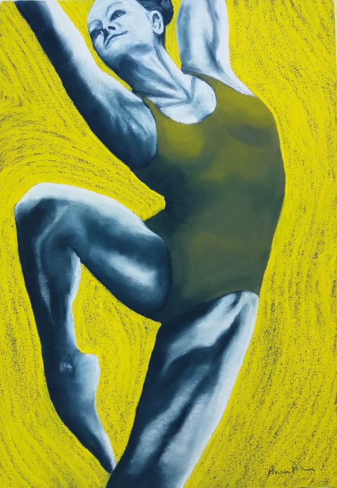
I got bit carried away with this next part. I started off wanting to try to capture both the power of the dancer’s muscles and movement by incorporating background marks within a more tonal piece depicting muscle form. In addition I wanted to add colour into some drawings. I chose to work with pastel using a photo and some of my studies published previously. By sticking to dancers and using pastels I felt I was back full circle to Degas’ ballet dancer drawings! However I chose to concentrate on capturing power rather than beauty.
Dancer I. Pastel on colourfix paper
Degas this ain’t but I think there is movement and energy here! I have messed up the layering of the orange and purple pastels in places, but the swirling does produce an idea of the dancer moving through the air with energy. I drew with energy and coloured in quickly often using the broad side of a piece of pastel. I have a huge amount of fun doing this, it got my adrenaline going. However I am disappointed with the muscle form in many places (especially the dancer’s extended left leg) , I can do better than that. The boundaries between light and dark areas is too scrappy to be believable and as a consequence the leg gets flatter as you go down the drawing.
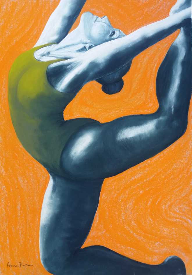
I was quite fired up by doing this piece and the energy I felt in producing it that I went on to do a different pose, this time trying to capture more form in the muscles. Dancer II is the result.
Dancer II Pastel on colourfix paper
I didn’t layer different coloured pastels in the background, rather let the dark colour of the ground appear through the red swirls. This hasn’t photographed very well at all and it is more evident in life. I am still disappointed with the muscle form here and I have got some proportions wrong (her right leg looks huge!) This dancer has a certain amount of grace but not a lot of movement or muscle power. I felt that the composition was also not great, there are a lot of thin limbs with much negative space around them. I went back to my studies and played about with the idea of cropping the image closer to be more like a view of dancer I (the pencil boxes around some of the studies in the previous post).
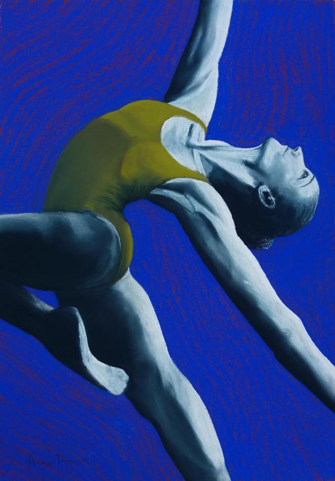
So a bit fired up with colour and the need to create a convincing muscle tone, I did some more! I kept to a limited palette as I liked the effect that the bright almost neon background tones have on the eyes. The vibrancy of the colour adds to the idea of movement by creating a slight optical illusion of movement that your eye can’t quite focus on. I am not sure how to describe this really, it has a sort of kaleidoscope effect.
Dancer III Pastel on colourfix paper
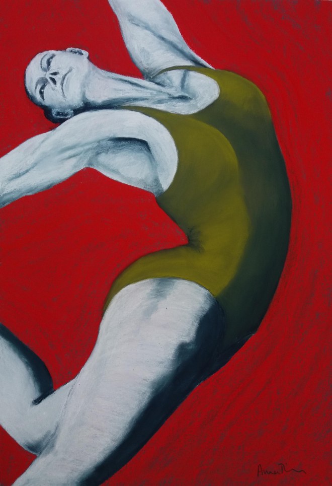
Dance IV Pastel on colourfix paper
Dancer V Pastel on colourfix paper
Dance VI Pastel on colourfix paper
The dancers are a bit too stylised perhaps but the swirls of the background are more evident than in the drawings previously. The conveyance of movement is more obvious in the yellow pastel of Dancer III. Maybe there is something about this pose that allows the negative spaces to swirl in a convincing way as I don;t get such a strong sense of this in the other dancers. The composition for Dancer V works better closer in that the previous drawing of the same pose (Dance II). I am also more happy in general with the depiction of muscle tone, especially for Dancer IV and Dancer V. The drawings show power in the muscle groups. They are not ‘pretty’ dancers, but it is of my opinion that the female form isn’t particularly pretty when under tension with lots of muscle mass and tendons showing. The beauty and grace of dancers comes from the fact that the moves they execute look effortless to perform.I think that idea comes across in the drawings above They aren’t pretty in the conventional sense, but they have poise.
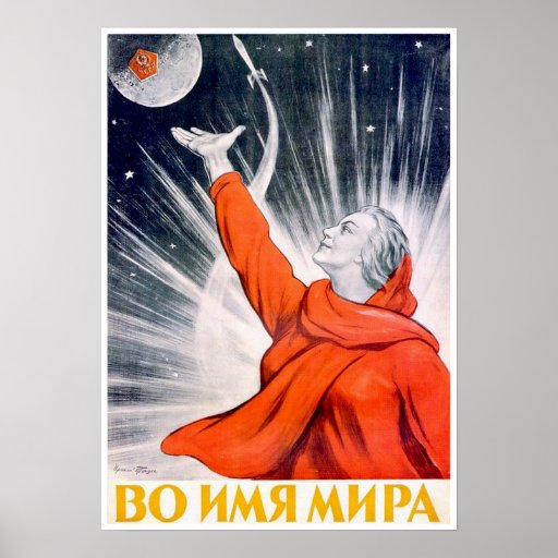
In the name of peace
I showed these to an artist friend who commented on how ‘neo-Russian’ they looked! Having consider that term a bit and done a bit of googling I have come to the conclusion that he was referring to the illustrative style of Russian propaganda posters such as the Soviet Space poster ‘In the name of peace’ here. This wasn’t quite my intention, but I can see where he is coming from.
On reflection: If I compare these to the quick sketchbook studies in my previous post these drawings are a little too stylised. Whilst as a group they are bold and bright, the colour isn’t actually adding anything to the sense of movement, and once again, they don’t suggest a fleeting moment, rather they capture a pose which isn’t the same thing at all.
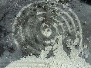
Here I am trying a new technique of mark making. I have traced over a photograph with a blunt point of a small screw-driver whilst resting on the page. I have then used coloured charcoal to block in areas revealing the tracing underneath. The left image has been left, the right has then been smudged to soften the effect. Some of the lighter areas have been lifted out with a putty eraser too
Tracing – reveal with coloured charcoal
Tracing – reveal with smudged colour charcoal
I like the delicacy of this technique. I have done some reveal drawings previously using white oil pastel and then a wet media over the top. Using a metal point allows much finer lines to be drawn. I realise these are not true drawings as I actually traced the image but it was the technique I was interested in rather than the image itself. I would like to come back to this technique with true drawing a little later.
Studies of a jumping Dancer
1. Study in pencil
2. Study in charcoal
3. Study in pencil
4. Study in pencil
These are studies that make up a fairly large body of preliminary material in my sketchbook along with the ones presented below. I don’t intent to discuss each study – they mostly are of no merit other than being part of the exploratory process. However it is worth noting that the more gestural the marks (such as the legs in study 3 above) the more convincing the pose and the sense of movement. I am getting the idea that for movement the concept of ‘less is more’ may apply.
More studies of various poses
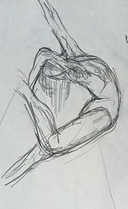
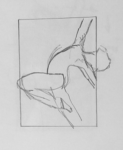
1. Study in drawing stones on clear gesso
2. Study in charcoal
3. Study in pencil
4. Study in pencil
5. Study in pencil
6. Study in pencil
7. Study in pencil
8. Study in white pastel pencil over charcoal
9. Study in coloured charcoal
Again not much worth saying about most of these studies although studies 1, 8 and 9 are Interesting. Study 1 is rather successful I feel- again less is more, there is very little detail and yet it shows an energetic movement. I like the fact that the person is no more than gestural lines, but the power of the movement is present. The background for study 8 adds interest to the drawing although not much movement. Here I have covered the paper with charcoal marks then smudged them all over then finally removing loose pigment with a rag. This led me to consider adding a background of a more sturdy material, gesso, the results of which are presented below. Study 9 is also worth mentioning simply because it took me roughly 45 seconds to do, using my memory of the photographic pose rather than looking at the photograph. Once completing I did wet and smudge the charcoal in places to see what happened – nothing much exciting it turns out and I moved quickly on to something else. However on returning to the study a few days later and putting it with the others I was struck by how spontaneous the pose looked (as in fact is was). So I have added spontaneity to my idea of less is more. Certainly any work that I have ever done for my tutor that has been complimented has been done quickly. It would seem if I think about the task too much I become tight and too regimented and caught up in detail
Making Background Marks
I used a broad wallpaper paste brush to apply clear gesso to some paper, applying strokes in random directions. I then drew over the top when dry using coloured charcoal, smudging areas to bring out the brush marks in the gesso.
1. Coloured charcoal over gesso
2. Coloured charcoal over clear gesso
3. Coloured charcoal over gesso
4. Charcoal over gesso
Using the clear gesso to provide texture and possibly lines of movement was an interesting exercise on two accounts. Firstly I could not see the gesso as it went on so the resulting marks were revealed as the charcoal was applied over it. The resulting effect does not really create a sense of movement but does add texture to the drawings. Secondly this texture was great at producing form of the body if it was in the right place! Whilst none of these are any great shakes, I think that drawing 3 of this set is the most successful. The dancers right leg is a good example where the textural quality of the gesso is providing form to the muscles. I am quite aware that drawing 4 has become quite ‘arty’ something that I am keen to avoid! As I am typing this retrospectively I must warn you that unfortunately I go through a bit of an arty phase before I get to the end of this!! I have to say though that I prefer some of the smaller studies above ( the 3 I thought worthy of mentioning at least) to these big studies. In a way they have become too pictorial and too detailed. They are not capturing a fleeting moment, rather a held pose.
Finally I decided to see what the effect of pastel over gesso was. Using broad side strokes I created a quick sketch from memory of a person’s torso using quite stylised curves. By adding a contrasting background colour I was able to create an interesting visual effect, that of swirling (doesn’t come across in photo very well). With hindsight I realised that the gesso underneath was a bit unnecessary as I could just use a course toothed paper, however I did like the effect and wondered if I added it to my dancers if that would create a sense of movement.